Dashboard
Description
The Dashboard is the first page you see when you log in to Feedlync. It provides an overview of your farm data and the latest activity. The dashboard is customizable, so you can choose which tiles to display.
Accessing the dashboard
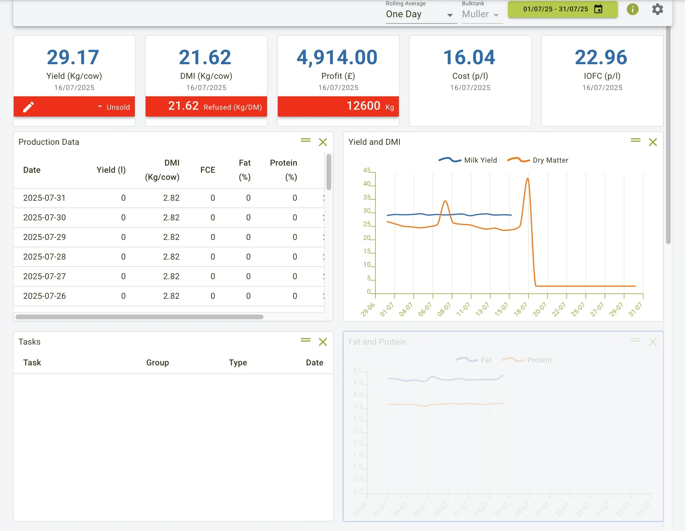
To access the dashboard, log in to Feedlync and it will be the first page you see. The dashboard shows a lot of useful information and is designed to give you a quick overview of your farm’s performance.
You can also access the dashboard from the side menu by clicking on the Home link.
Using the dashboard, you can quickly see important information about your farm using the filters in the toolbar.
- Rolling Average: This filter allows you to select the time period for the rolling average. In the example, “One Day” is selected.
- Bulktank: This filter allows you to select the bulk tank you want to view data for. In the example, “Muller” is selected.
- Date Range: This filter allows you to select the date range for the data you want to view. In the example, the range “15/12/25 - 15/01/26” is selected.
The dashboard tiles each display a different type of information that is useful. You can customise the dashboard to show the information that is most relevant to you. More information on how to customise the dashboard can be found in the tiles section below.
Dashboard view
The dashboard shows key metrics via KPIs:
- Yield (Kg/cow)
- DMI (Kg/cow)
- Profit (£)
- Cost (p/l)
- IOFC (p/l)
You can also view detailed information in different tiles such as:
- Production Data: Shows daily records including Date, Yield, DMI, FCE, Fat %, and Protein %
- Yield and DMI: Displays trends of milk yield and dry matter over time
- Fat and Protein: Shows fat and protein percentage trends
- Tasks: Lists scheduled tasks with their group and type information
Rolling Average
The Rolling Average filter sets how many days of data are averaged before values are shown in the tiles and charts. You can choose from 1, 3, or 7 days to smooth short-term spikes and see clearer trends.
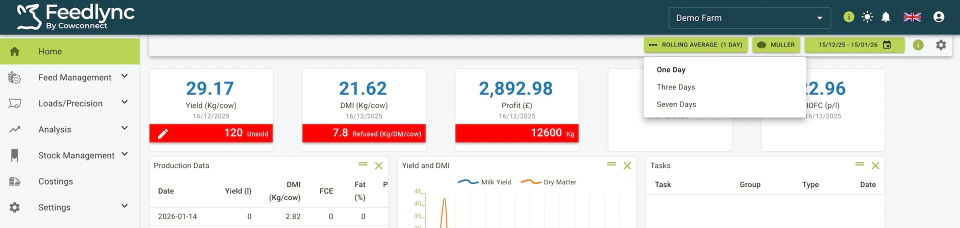
How to change the rolling average using the toolbar shown in the screenshot:
- Select the green Rolling Average pill in the toolbar (left of the bulktank selector).
- Choose One Day, Three Days, or Seven Days from the dropdown. One Day shows the raw daily values; Three Days and Seven Days apply a trailing average over that window.
- The KPI tiles and any tiles that graph DMI, yield, profit, or cost update immediately using the selected window.
Bulktank
The Bulktank filter allows you to select the bulktank(s) you want to view data for. You can choose from the list of available bulktanks associated with your farm.
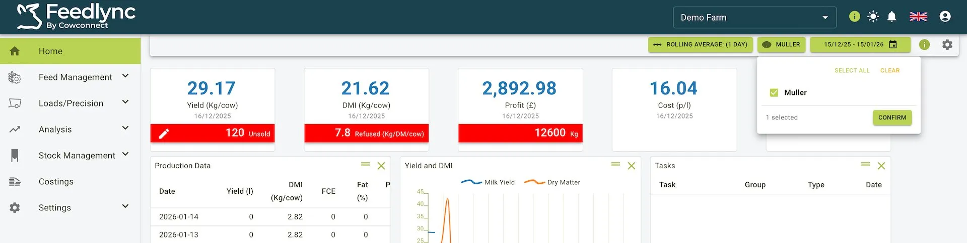
How to use the bulktank selector shown in the screenshot:
- Click the green Bulktank pill in the toolbar to open the selector.
- Tick one or more tanks using the checkbox list (the banner at the top shows how many are selected).
- Use Select All to include every tank, or Clear to reset selections.
- Press Confirm to apply. The KPI tiles and charts (Yield, DMI, Profit, Cost, IOFC, Production Data, Tasks, etc.) refresh to show only data for the selected tanks.
Date Range
The Date Range filter allows you to select the date range for the data you want to view on the dashboard. You can choose a start and end date using the date picker.
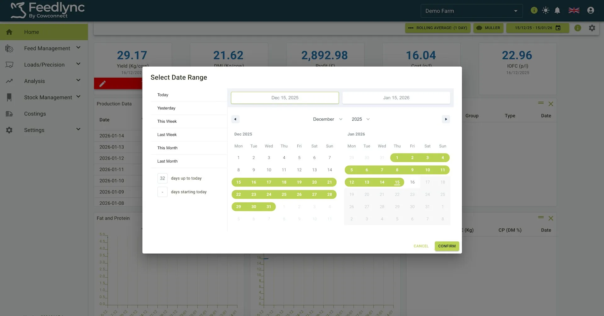
How to use the date range picker shown in the screenshot:
- Click the green Date pill in the toolbar to open the picker.
- Use the quick shortcuts on the left (Today, Yesterday, This Week, etc.) if you want a preset range.
- For a custom range, select the start date in the left calendar and the end date in the right calendar; both fields at the top update as you pick.
- Navigate months with the chevrons beside the month/year labels; the selected range is highlighted in green across both calendars.
- Press Confirm to apply. All KPI tiles and charts refresh immediately using the chosen dates, combined with any rolling average and bulktank filters already set.
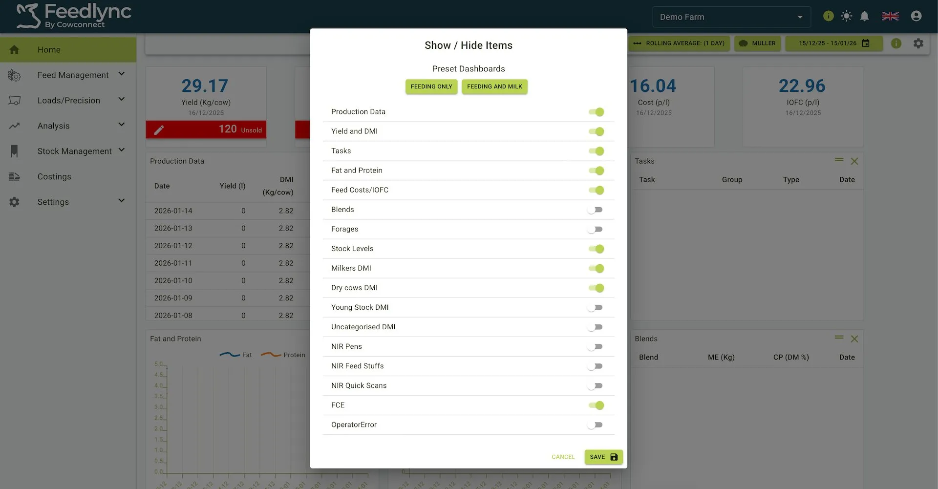
Tiles
Tiles are small blocks of information that you can add to your dashboard. They provide a quick way to see important data at a glance. You can add, remove, and rearrange tiles to suit your needs.
Tile panel
The tile panel is located in the top right corner of the dashboard. It contains a list of all the available tiles that you can add to your dashboard. The tiles have grouped categories called Presets, there are two currently named Feeding Only and Feeding and Milk.
The Feeding Only preset contains the following tiles:
- Yield and DMI: This tile shows the rolling average of the yield and DMI for the selected date range.
- Stock Levels: This tile shows the stock levels for the selected date range. _ Milkers DMI: This tile shows the rolling average of the milkers DMI for the selected date range.
- Operator Error: This tile shows the operator error for each operator over the last 7 days.
The Feeding and Milk preset contains the following tiles:
- Production Data: This tile shows daily data including Date, Yield (l), DMI (Kg/cow), FCE, Fat (%), and Protein (%).
- Yield and DMI: This tile shows trends with two lines - blue for Milk Yield and orange for Dry Matter.
- Fat and Protein: This tile shows trends with two lines - blue for Fat (%) and orange for Protein (%).
- Tasks: This tile displays scheduled tasks with columns for Task, Group, Type, and Date.
- Feed Costs/IOFC: This tile shows the feed costs and IOFC for the selected date range.
- Stock Levels: This tile shows the stock levels for the selected date range.
- Milkers DMI: This tile shows the rolling average of the milkers DMI for the selected date range.
- Dry cows DMI: This tile shows the rolling average of the dry cows DMI for the selected date range.
- FCE: This tile shows the rolling average of the FCE for the selected date range.
Each of these presets can be changed after selection and are usually used to get you started with the tiles you want to see. You can also add any of the tiles from the list to your dashboard.
The tile panel is also where you can remove tiles from your dashboard. To do this, simply click the toggle button next to the tile you want to remove. The tile will be removed from your dashboard and the toggle button will be turned off.
You can also rearrange the tiles on your dashboard by clicking and dragging them to a new position. This allows you to customise the layout of your dashboard to suit your needs. More on this can be found in the rearranging tiles section below.
Tile panel view
Adding a tile
To add a tile to your dashboard:
- Select the cog icon in the top right corner of the toolbar to open a panel to toggle a tile from the list.
- Click the toggle button next to the tile you want to add.
- Click the
Savebutton to save your changes.
You can add as many tiles as you like to your dashboard from the list available including presets you can view at the top of the panel.
Removing a tile
To remove a tile from your dashboard:
- Select the cog icon in the top right corner of the toolbar to open a panel to toggle a tile from the list.
- Click the toggle button next to the tile you want to remove.
- Click the
Savebutton to save your changes.
Rearranging tiles
The dashboard tiles have the functionality to move them in the order of the users preference. This can be done by following the outlined instructions below.
To rearrange tiles on your dashboard:
- Click the double line next to the cross and drag a tile to move it to a new position.
- Release the tile to drop it in the new position.
- Your changes will be saved automatically.
You can rearrange the tiles in any order you like. This allows you to customise the layout of your dashboard to suit your needs. This is useful if you want to see certain tiles first or if you want to group similar tiles together per row or any way you might like.
Rearranging tiles view