Layout
Description
The Layout of the Feedlync portal is designed to be user-friendly and intuitive. It consists of a few key components that help you navigate and access the features of the app easily.
Layout components
The layout of the Feedlync portal consists of the following components:
- Header: The header contains the Feedlync logo, the farm selector, theme mode toggle button, the change log notification button, language select and the user pop out. It is always visible at the top of the page.
- Sidebar: The sidebar contains links to the main sections of the app, such as Dashboard, Feeding, and Settings. Each feature can be collapsed to save space while looking for other features.
- Main content area: The main content area is where the main features of the app are displayed. It is responsive and adjusts to fit the screen size.
Header
The header is located at the top of the page and contains the following components:
- Farm selector: The farm selector allows you to switch between different farms if you have access to multiple farms.
- Documentation Link: The documentation link provides quick access to the Feedlync documentation.
- Theme mode toggle button: The theme mode toggle button allows you to switch between light and dark mode.
- Notifications: The notifications button shows you the latest notifications related to your farm data.
- Change log notification button: The change log notification button shows you the latest changes made to the farms data.
- Language select: The language select allows you to change the language of the app.
- User pop out: The user pop out allows you to view some user information like name and email, as well as the Logout button and the Terms of Service and Privacy Policy links.
Header view

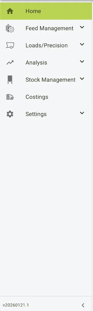
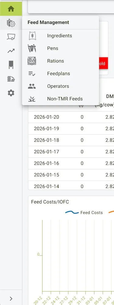
Sidebar
The sidebar is located on the left side of the page and contains links to the main sections of the app. It is always visible and can be collapsed to save space.
The sidebar is divided into top-level sections: Home, Feed Management, Loads/Precision, Analysis, Stock Management, Costings, and Settings. Each section can be collapsed/expanded, and expanding Feed Management reveals quick links to Ingredients, Pens, Rations, Feedplans, Operators, and Non-TMR Feeds as shown in the expanded view.
This is the main navigation area of the app and allows you to access different features quickly. You can collapse each section to save space while looking for other features. The app version is also shown at the bottom of the sidebar for quick reference.
Sidebar view
 |  |
|---|
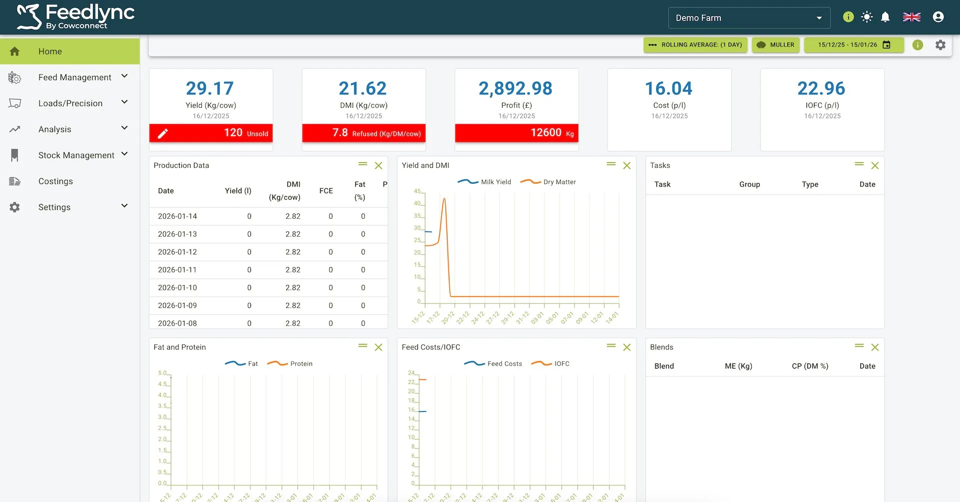
Main content area
The main content area is where the main features of the app are displayed. It is responsive and adjusts to fit the screen size.
More information on the main content area can be found in the dashboard section.
Main content area view